Transparency is one of the key ingredients of Agile, and burndown charts are widely seen as one of the most important tools for achieving this transparency.
My problem is: I hate burndown charts.
Everyone is completely hung up on those charts now. Scrum Masters end up having conversations like:
- „Let’s talk about your team’s progress. Where is your burndown chart?“
- „I had a look at your burndown chart, and it didn’t look good!“
- „You DON’T have a burndown chart? Uh-oh!“
The first two are things you often hear from project managers. The third one came from a Scrum Master, and I could immediately tell that it made him judge me: „No burndown chart? Such a bad Scrum Master!“
I would go as far as proposing an „Agile Mindset Test“: When someone enters a team room, do they walk over to the burndown chart, or do they walk over to the task board? I think their choice says a lot about their agile mindset.
I admit, it is of course a somewhat natural reaction to walk over to the burndown chart first. People prefer an image over a wall full of text. But does that image truly represent what the team is doing and how it is doing its work? No, of course not! And that is one big problem with burndown charts. Of course, a flat burndown chart indicates that there could be some kind of problem, but that is where it has already reached the limit of its usefulness. There could be some kind of problem. That’s it.
My other problem with burndown charts is that they are simply non-agile waterfallish artifacts to me. One of my former companies used „race charts“ towards the end of the projects (i.e. in the test phase, as these were waterfall projects). These race charts (you also could have called them “burndown charts”) showed how many bugs of a certain type were still open and by when that number must reach zero. There were two issues with this: First: New bugs were constantly being discovered, but that was not reflected in the race chart. They simply made the curve look flat, or often the curve even went up. Second: The completion date was arbitrary and had nothing to do with what we COULD do – it was only related to what we HAD to do. We were in a situation with fixed cost, scope, quality and time.
Many people would assume now that in such a situation, teams would give up quality first. But actually, the first victim of this scenario was not quality but common sense. As it was usually impossible to reach the goal, a lot of effort was put into making the statistics look nicer, and a lot of items were simply pushed out of the race chart, resulting in a „not my problem“ attitude. In general, the chart did nothing to create a positive atmosphere, it did nothing to make people work better, it did nothing to motivate people and it certainly did not create any kind of transparency. It only created pressure and killed common sense. I believe that burndown charts in general tend to kill common sense.
I know, burndown charts are seen as a useful tool for retrospectives. „Why was our burndown chart flat for several days during the Sprint?“ is a valid question to ask. But to ask that question, does the chart have to hang visibly in the team room during the Sprint? Oooh, heresy, I know! We are supposed to be transparent. But there are other, better tools to be solve the same issues a burndown chart is supposed to solve and to create the necessary transparency for that.
For example, if tasks tend to spend several days on the task board, this would result in a flat burndown chart. But if you commonly have that kind of problem, I feel it is much better to put some kind of marker on the tasks after every Daily. That way, you can see which tasks are not moving forward, and you can address it immediately. When you speak about a flat burndown chart in a retrospective, a lot of people will not remember anymore why exactly it was flat. In fact, some tasks might be moving quite quickly, while others are stuck in „In Progress“ for several days, so the chart looks fine, but the real progress is perhaps not fine at all.
Another counter proposal to burndown charts are burnup charts. This is not intuitively clear to many people, as burnup charts seem to be upside-down burndown charts and nothing else, but in my opinion, the difference is huge!
The major difference is that burnup charts always represent the work that was done. If you completed a task, the burnup chart „rewards“ you. In a burndown chart, if you complete a task, while another team member adds an additional task that was missed in the Sprint Planning, then the chart remains flat. Is that supposed to be motivating? If anything, it motivates people not to add new tasks, even if they would be needed. I have heard the statement „This makes our burndown chart look bad“ quite a few times. Is that what we want?
Burnup charts always go upwards, towards the goal. They very rarely go down (only if you have to put a task back from „Done“ to „In Progress“, which is hopefully a rare occurrence). And what is at least as important, they not only visualize the progress towards the goal, they also visualize the goal itself. Of course, the general idea is that the scope of a Sprint should not change, but let’s face it: It often does, and the burnup chart visualizes this. What’s more, if the team misses the Sprint goal because it was forced to add additional work to the Sprint, then the burnup chart can immediately prove that the team did as much work as it had predicted, even if it did not reach the original goal.
Take the following burndown chart as an example:
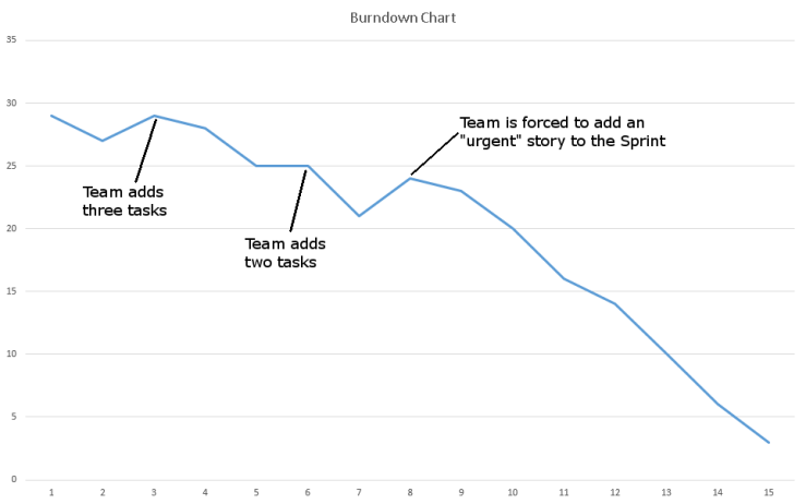
Here, the team realized twice that new tasks have to be added to existing user stories. This causes the burndown chart to go up or to remain flat. This is a situation where teams are often reluctant to add new tasks because it “makes the burndown look bad”.
In the middle of the Sprint, the team took another story into the Sprint, because someone claimed that it was terribly urgent. And of course, this should not happen. But let’s be realistic: It does happen. And thanks to these additions to the Sprint Backlog, the burndown looks very bad for the first eight days. That is the point where nervous project managers drag the Scrum Master and Product Owner into their office or, even worse, start pestering team members about their bad progress.
Here is the same scenario presented in a burnup chart:
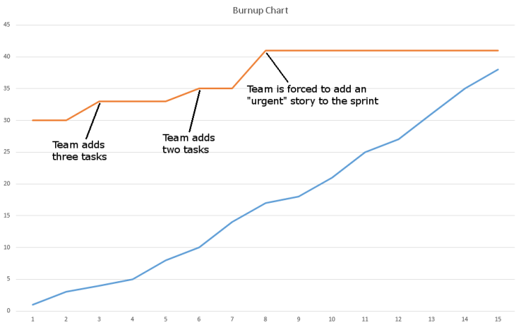
The red line at the top visualizes the total number of tasks, while the blue line visualizes the progress. The first noticeable point is that the blue line always goes up and that the team actually worked at a reasonably constant pace. If you only have the burndown chart, then the first question in a retrospective would be: “Why was our burndown chart so flat?” If you have the burnup chart, you can ask the much more meaningful question: “Why did we end up adding tasks? Do we need to improve something about our Sprint Planning?” You get to the point much quicker and you do not waste so much time on trying to interpret a chart.
Also, you can see immediately that the blue line would have reached the red line if a new story had not been added. So the team’s original plan for the Sprint was definitely feasible. What caused the Sprint Goal to be missed was the new story that was forced upon the team.
So I will continue to argue for the eradication of burndown charts. Sadly, all software tools used for agile planning (such as JIRA, TFS) spit out burndown charts, and people will continue to look at these charts. We cannot influence that. But at least our teams and we as Scrum Masters still have the power to decide how we want to visualize our progress in our team rooms!